
Develop a new branded identity for an already historically successful sports team
THE CHALLENGE
THE SOLUTION
A new logo, type, and identity for the Boston Celtics inspired by their 18 championships and the spirit of Boston itself.
In redesigning the Boston Celtics logo, my focus was on capturing the team's storied history of success and the industrious spirit of Boston. The new design marries classic elements with modern aesthetics to reflect the grit and determination that define both the city and its beloved basketball team.
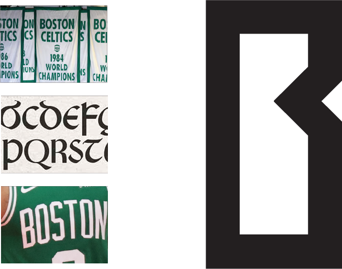

At the start of this rebrand, I wanted to make sure that there were references to the storied success of the franchise throughout the design. The inspiration for the type came from traditional Irish lettering, the championship banners, and the existing jersey lettering.

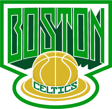
Utilizing these new letter forms, I created a logo from the perspective of a player looking into the rafters of TD Garden and seeing all of the championship banners that are represented by the letters of Boston.
The decision to remove Lucky the leprechaun was not an easy one, but necessary for this new direction. The often negative stereotypes associated with the portrayal of Irish people were something I wanted to avoid, so I chose to have a nod to Lucky by reimagining his bowler hat in gold to, again, reference the championship trophies that Boston has won. The bowler hat also serves as a symbol of the hard-working and gritty people of Boston itself.

ALTERNATE MARKS


LET'S SEE MORE
-
LET'S SEE MORE -